How to choose your colours 101
Hiya!
I decided to make a post about colours and touch on colour theory. I've always
liked using colours that contrast in my work (because I'm a rebel like that!)
So this post is for anyone who needs some tips on picking contrasting and
complementary colours.
1)
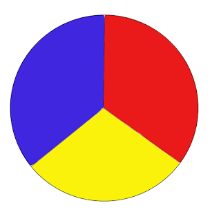
Secondary Colours VS Primary Colours
The easiest way to pick contrasting colours is going back to basics. This means
looking at secondary colours and using their primary hues to determine the
contrasting hues. For example, to make Orange you need Yellow and Red, the odd
primary colour out is blue. This means that the contrasting colour of orange is
blue.
 |
| primary colours |
2)
Complimentary Secondary tones
Another
layer to colour theory is choosing a warm or a cool tone A lot of people
(myself included) often place a warm and a cool colour together to make a
complimentary colour palette. For example, there is orange & green. One is
made with 1 warm primary colour (yellow and red) and the other with a cool
primary colour (yellow and blue). But because both colours include yellow in
their hue they work well together.
 |
| secondary colours wheel |
3)
Tertiary Colours
Placing
warm and cool colours together is a good start; however, this can be quite
confusing as all colours can come in both warm and cool tones. A good example
is purple. A basic purple is made by mixing primary colours blue and red,
however blue is a cool tone and red is a warm tone. So is purple a cool colour
or a warm colour? Well, that depends on the mixing ratio. If you added more red
than blue, you would get magenta purple, which is like warm pink-ish purple. If
you add more blue than red, you would get an indigo cool purple.
 |
| tertiary colour wheel |
4)
Primary and Secondary Colour Mixes
As
always with colours, there are many hues that can make colours overwhelming but
means you have plenty of hues to choose from. A good example is yellow. Even
though it's a primary colour, Yellow on the colour wheel can be considered a
warm and a cool colour. When blended with its neighbouring secondary colour,
green, it can create a tertiary yellow with green tones. In that case, it could
be considered a cool colour. However, if turning towards the other side of the
colour wheel, with the other secondary colour, orange, when mixed will create a
more warm yellow.
And
there you have it! Some tips on picking colours for your art, home, clothes,
pretty much anything you like.
If
you guys have any other tips for picking colours, please don't hesitate to
comment down below!
Also
share, pin and subscribe to my blog via email for more artist tips and tricks!
Thanks
for reading & keep being creative!
Glo
X


Comments
Post a Comment