How to choose your colours 101
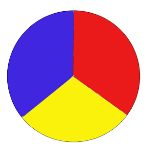
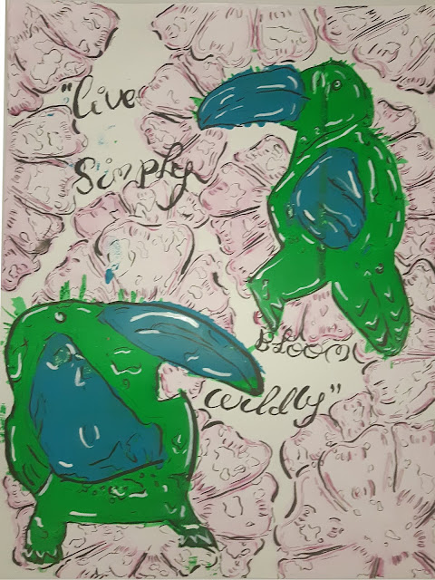
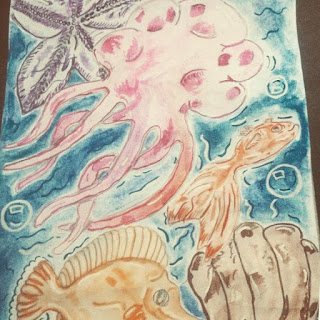
Hiya! I decided to make a post about colours and touch on colour theory. I've always liked using colours that contrast in my work (because I'm a rebel like that!) So this post is for anyone who needs some tips on picking contrasting and complementary colours. 1) Secondary Colours VS Primary Colours The easiest way to pick contrasting colours is going back to basics. This means looking at secondary colours and using their primary hues to determine the contrasting hues. For example, to make Orange you need Yellow and Red, the odd primary colour out is blue. This means that the contrasting colour of orange is blue. primary colours 2) Complimentary Secondary tones Another layer to colour theory is choosing a warm or a cool tone A lot of people (myself included) often place a warm and a cool colour together to make a complimentary colour palette. For example, there is orange & green. One is made with 1 warm primary colour (yellow and red) and the other wit...